
New design

Old design
DTVi Device Configuration Page
Business Proposal
Increasing the device attachment rate is critical to drive incremental revenue and strengthen customer retention across the DIRECTV platform.
Expanding the penetration of DIRECTV owned devices introduces the customers to join the ecosystem, providing a differentiated customer experience using DIRECTV’s streaming platform
Success rate and solution
DIRECTV progress within one month of release of the redesign initiative
How does DIRECTV's device differentiate itself from other options in the market?
DIRECTV offers the Gemini device because it allows the company to provide a controlled and unified experience to integrate customer’s current TV satisfaction, live TV and current streaming apps in one place, along with key features like voice control, DVR integration, simplified billing.
Background
Objective
To enhance DIRECTV customer experience through a comprehensive redesign of the device configuration page with the goal of:
-
Increasing upsell conversion rates
-
Boosting click-through rates (CTR) for promotional content
-
Driving higher checkout rates and overall revenue
What role do I play in the team, and how do I collaborate with others?
As the UX Designer, I collaborated on the end-to-end design process and seamlessly communicated with stakeholders to ensure clarity, business alignment and high-performance delivery.
Challenges
With increasing competition from digital-first streaming services, there’s a need to further engage users and increase sales of both existing subscribers and new customers. The current platform offers live TV and streaming services, but the device configuration page is not fully optimized to:
-
Highlight and upsell opportunities in an intuitive and engaging way
-
Guide users seamlessly toward higher-value packages, premium channels, or add-on services
-
Lack of information of the device and DIRECTV app
-
Provide clear and actionable call-to-action prompts to drive conversions
Solution
With a deep understanding of the user journey to keep in mind in the redesign initiative on both the Gemini device and DIRECTV platform, the key moments in customer experience include:
-
Onboarding-new subscribers should be introduced to upsell opportunities immediately after setup with relevant package recommendations
-
Content discovery: browsing content should naturally guide users toward higher-tier plans and premium channels
-
Checkout flow: the process of adding services or upgrading plans needs to be streamline and frictionless

2022 designs


Ongoing design iterations
Research & Design Spikes
Research goals
Discover how customers currently understand the device page and their behavior in progressing into checkout flow. What is the decision factor? What key points and information are they looking for? What’s the final decision-making for them?
Competitive analysis
Based on initial findings, the team analyzed competitors such as Roku TV, Apple TV, Amazon Firestick, Google chromecast to further explore the marketing approach of their streaming devices. What stood out the most when reviewing all of these services that many customers have previously brought up in user interviews? Information boggling
Actionable design approach
The actionable design approach is to provide a quick summary and state the key features of the device to entice the customers to take the device when it’s already included with the streaming packages.
Data collected
Qualitative data gathered through User Testing Interviews with at least 8 participants for each iteration process
-
Ensure compatibility and performance compared to other streaming devices?
-
How is this redesign going to drive an upsell and cross-sell opportunities?
-
How to increase customer’s stickiness and give DIRECTV more control the viewing experience which is essential in a highly competitive streaming landscape
Who are the users and what are their thoughts?
I collaborated with the research team to understand user’s frustrations:
-
People don’t look at the learn more, they want to checkout as quickly as possible, they know what they want
-
“Too pretty” of a design looks like an ad to the customer, they ignore it
-
People think if they don’t take the device, they will lose the streaming service
“Streaming TV” label reinforces to the users they’re receiving the service
During tests, without the label, shoppers were confused when they landed on the device page if they’re still receiving their streaming package.
Image of device in tiles was the most effective designs during user tests
The simpler tile designs proved to be the most effective, as they clearly guided shoppers through the product journey and helped them easily understand key features


Modern aesthetic vs simple design, simpler the better was the most effective
The simpler tile designs proved to be the most effective, as they clearly guided shoppers through the product journey and helped them easily understand key features.
In contrast, the more visually elaborate designs were often mistaken as an ad, causing users to disengage and show less interest in exploring the device or app. This insight reinforced that clarity and usability are more important than aesthetics when it comes to driving user engagement.
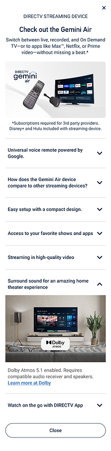
A new space efficient look, increasing engagement
User testing revealed that shoppers were more engaged with the updated FAQ-style layout featuring a dropdown modal.
Participants showed strong interest in quickly finding specific product features. The more concise and scannable design helped users easily identify relevant information, increasing their desire to click through and explore each feature in more detail. This suggests that clear, streamlined content paired with an interactive layout supports deeper product discovery.

Previous designs


Previous designs


Wireframes and prototyping:
Each screen was carefully reviewed for technical requirements and prototyped to confirm the interaction design was clear and feasible for both developers to implement and during user test sessions.